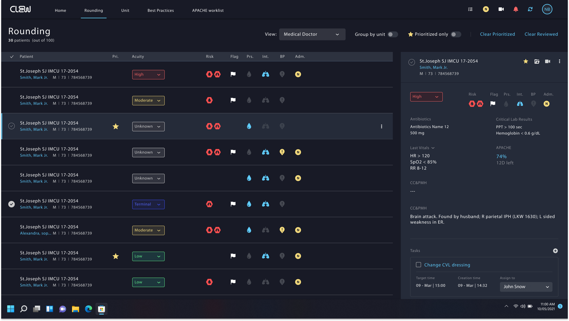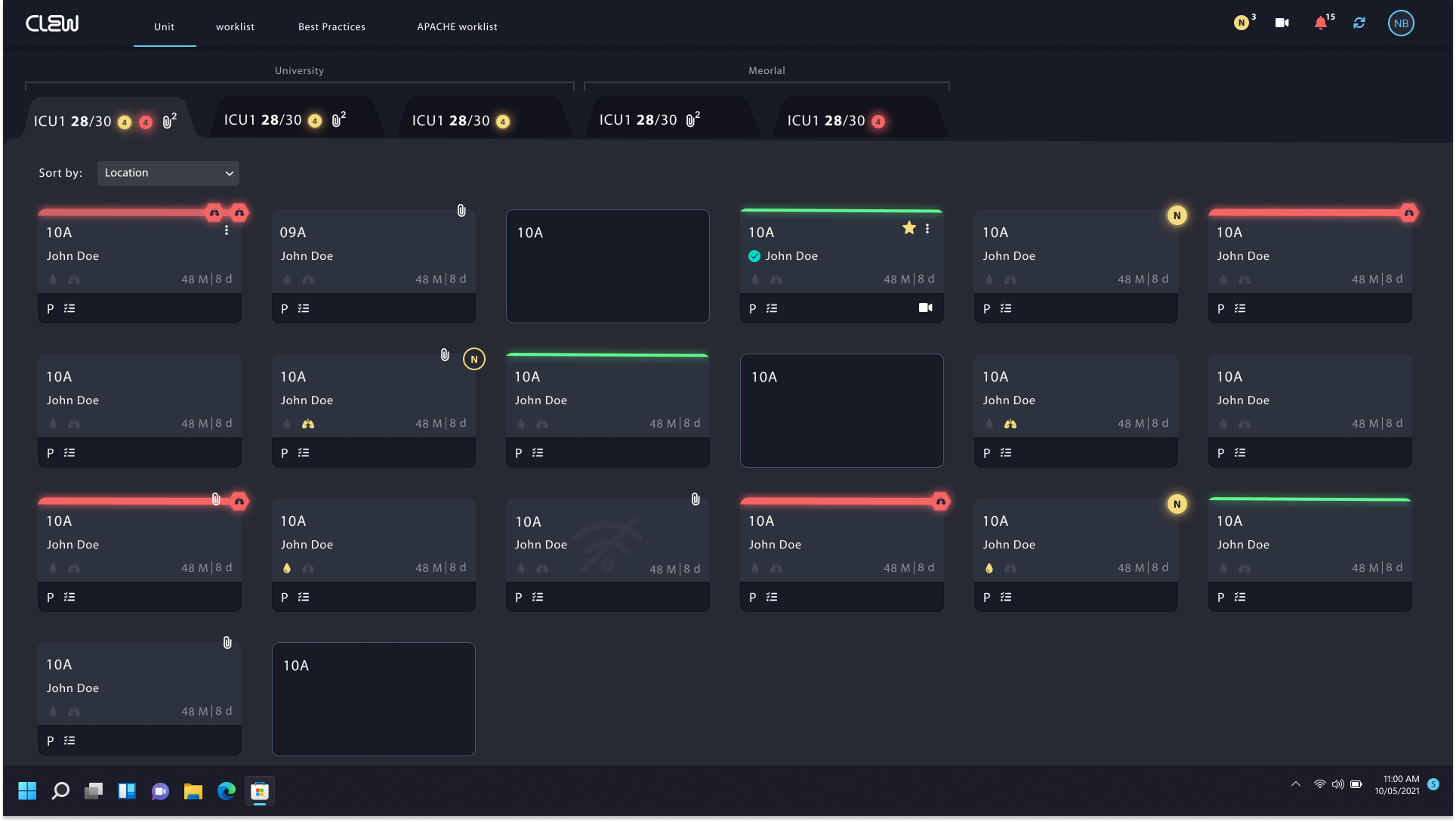


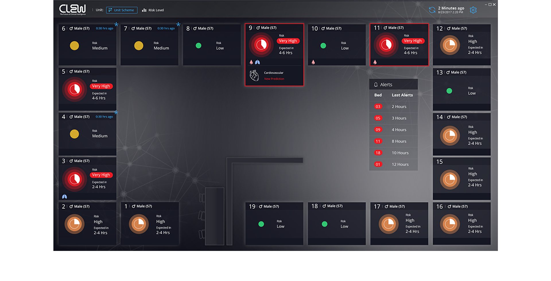
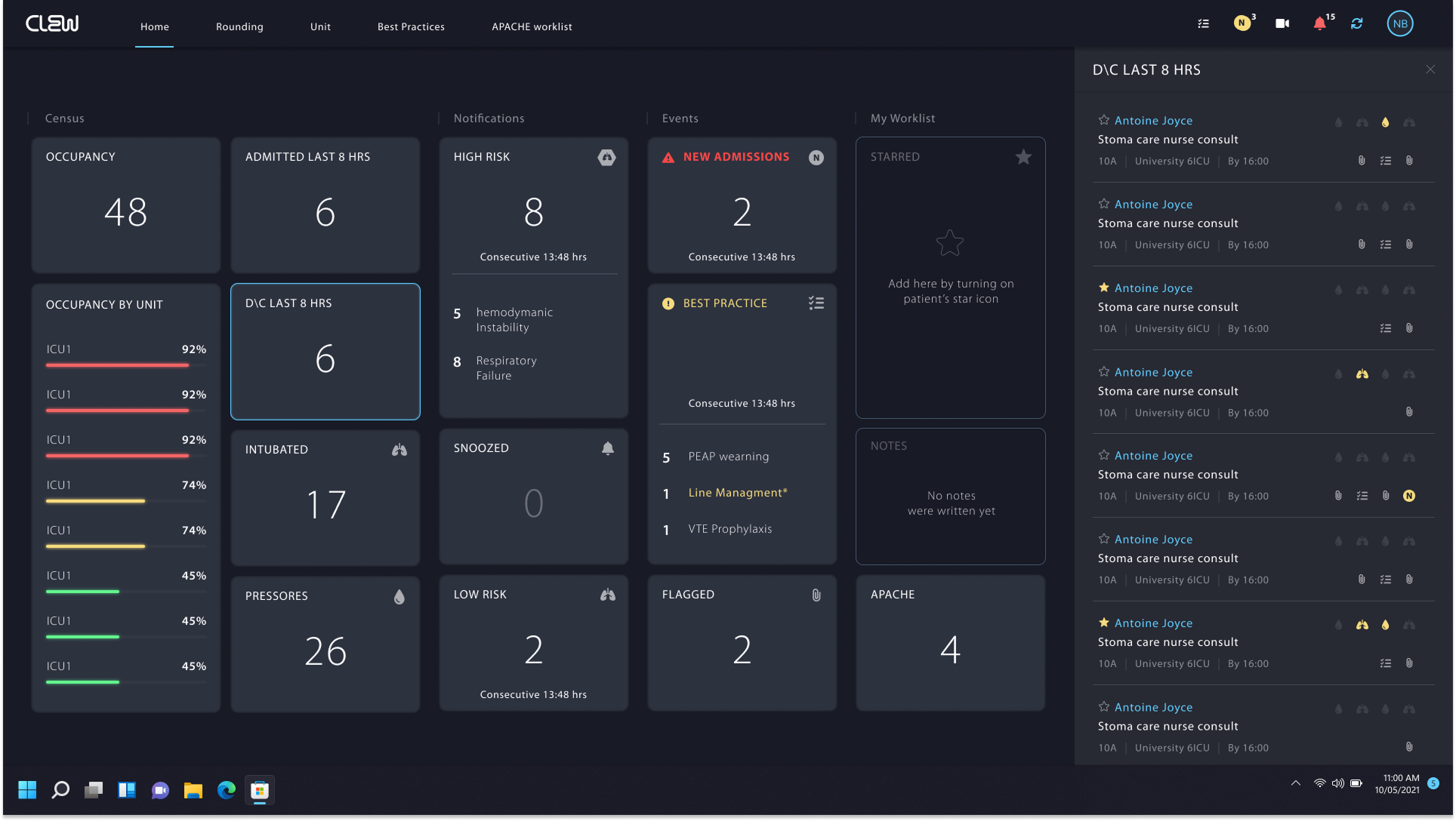
We designed a multi-patient dashboard that translates AI predictions and clinical risk into a visual experience that can be understood at a glance.
The dashboard includes a physical map of the ICU and patient cards that combine four critical pieces of information in one clear visual element: the clinical system related to the alert, the severity of the patient’s condition, the expected time range of deterioration, and the probability that deterioration will occur.
By using size, color, and graphic hierarchy, we created a fast and intuitive prioritization tool that helps clinical teams identify which patients require attention first and make smarter decisions under pressure.