Medical projects

Onit

More Projects:

The Company &
the Product

Onit is a startup in the private healthcare services space, offering users faster and more accessible ways to manage private medical needs.

The platform enables users to schedule appointments with specialist doctors, book medical consultations and tests, receive assistance with submitting insurance claims, and better understand their insurance rights in simple, accessible language.

Project Goal

To design and develop a web and mobile application that enables users to easily schedule private medical consultations, submit insurance forms, and understand their healthcare insurance rights in a clear and accessible way.

We led the product development from scratch — from designing an intuitive and friendly user experience to creating a complete product language that positioned Onit at the forefront of the private health insurance space.

In addition, we provided strategic guidance, content consulting, and support in connecting the product experience with analytics and marketing needs, creating a more complete, precise, and relevant product.

The Challenges

Simplifying Long and Complex Processes

Processes such as booking medical appointments, understanding insurance rights, and signing insurance forms can be long, complex, and emotionally loaded.

The challenge was to simplify these flows without oversimplifying important information – reducing friction, preventing abandonment, and helping users feel confident that they understand what they are doing.

Balancing Sensitivity with Lightness

Users often arrive at the system during sensitive moments, when they need fast access to medical help or guidance.

We needed to design an experience that feels calm, supportive, and reassuring, without becoming too playful or too light for the context. The challenge was to create a delicate balance between empathy, simplicity, and professionalism.

Creating a Complete Product Language from Scratch

The project required the creation of a full product language from the ground up, including interface patterns, illustrations, and micro-animations.

The design language needed to express Onit’s brand values – friendliness, innovation, simplicity, and support – while helping users complete important actions in a sensitive state of mind.

Executive Solution Summary

Executive Solution Summary

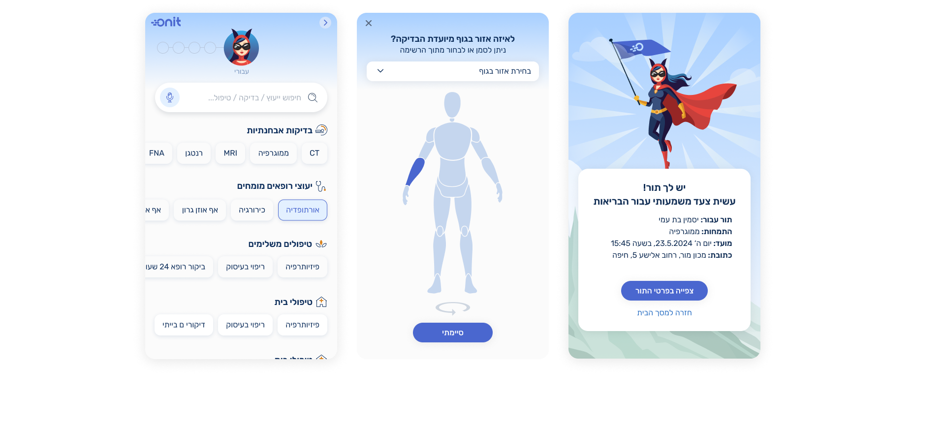
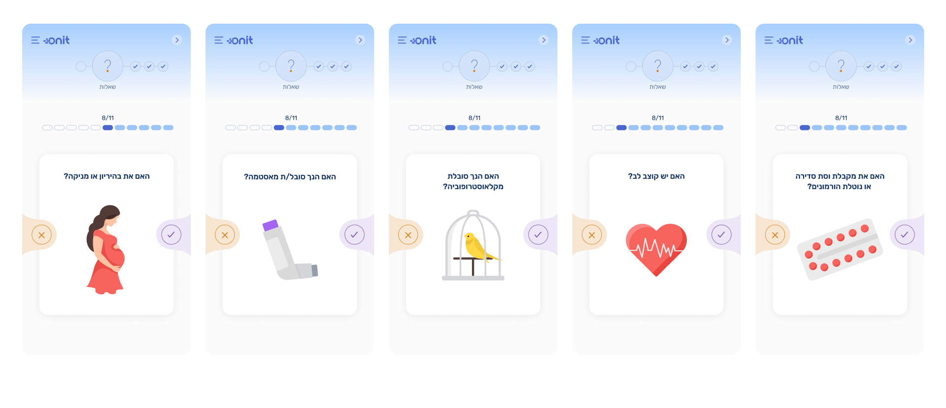
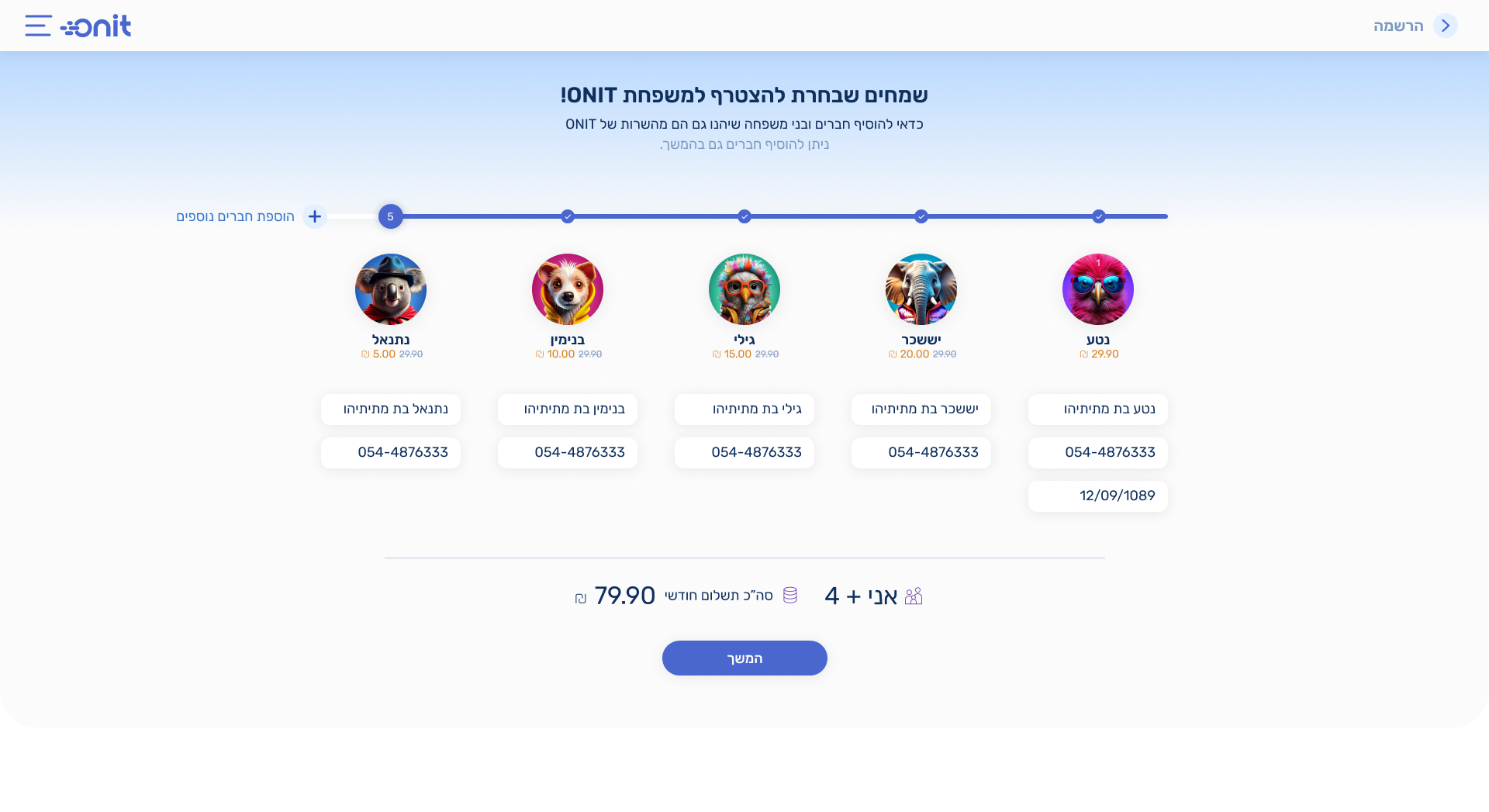
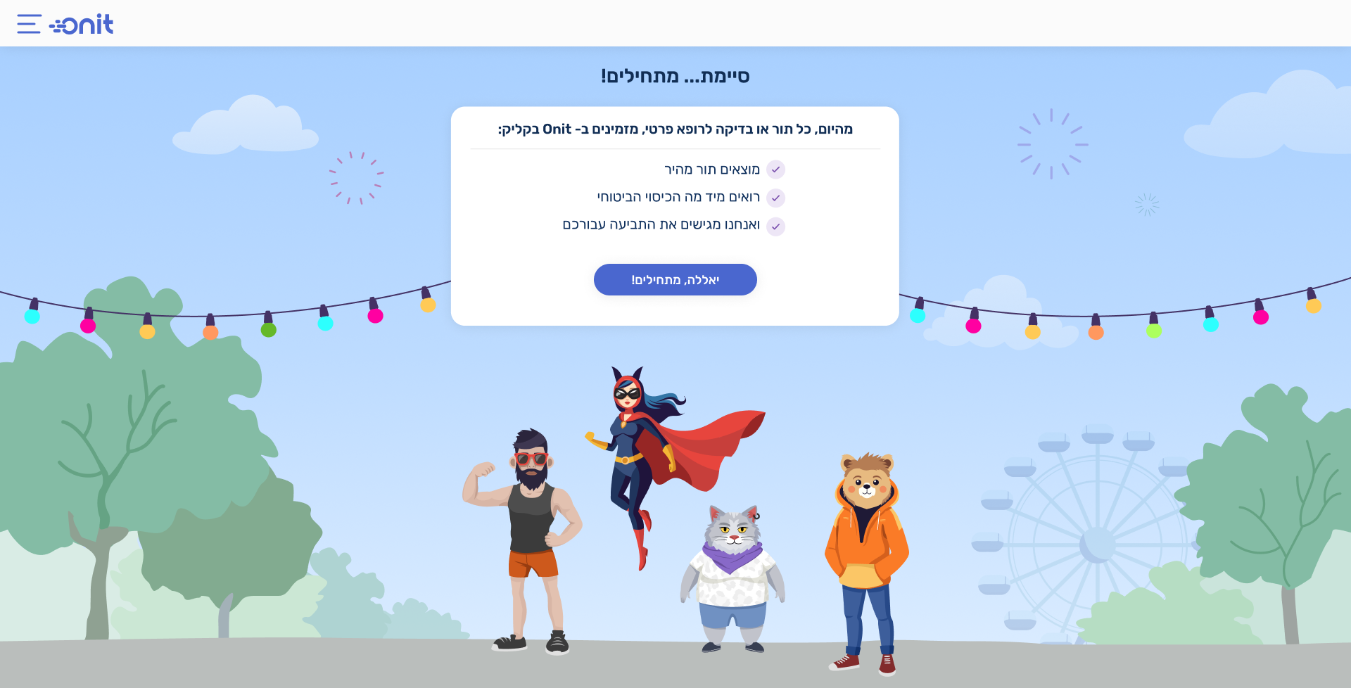
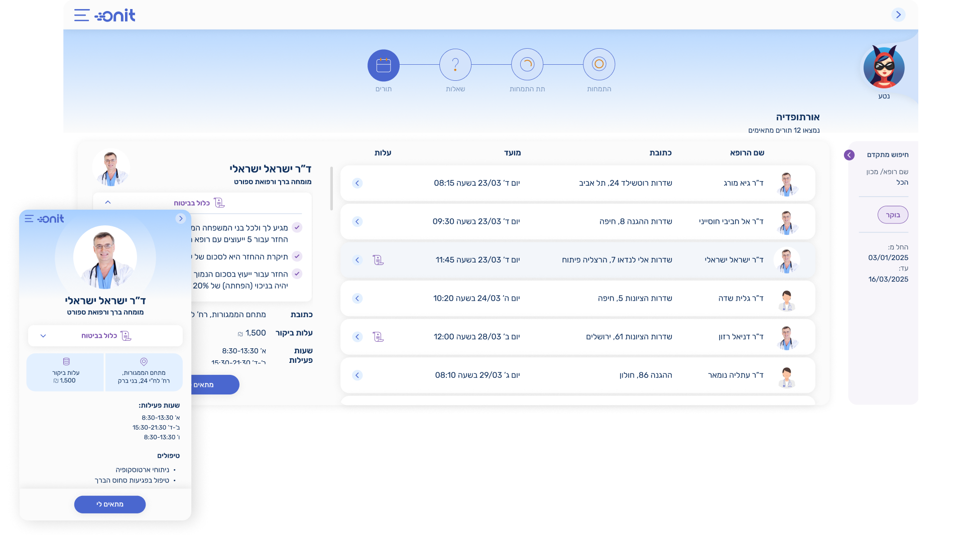
We created a soft, friendly, and contemporary visual language designed to support users during sensitive healthcare moments.

Pastel colors, gentle illustrations, and a calm interface atmosphere helped make complex medical and insurance-related processes feel more approachable, reassuring, and easy to complete.

Our Process

Group 1707478609
Group 1707478732 (1)
Group 1707478674 (1)

Design Sprint

We kicked off the project with a two-day Design Sprint, during which we defined the app’s goals, key user flows, and core experience principles.

By the end of the workshop, we had created the first UX concept, giving the team a clear direction for the product experience.

01
02

Cracking the Visual Concept

Through a focused and strategic process – including competitor research, goal refinement, and brand value definition – we created a complete product language for the app.

The visual language was built around a coherent product story that defined Onit’s world and brought it to life through unique characters, soft illustrations, and subtle animations.

Usability Testing & Continuous Improvement

After the app launched, we continued improving the experience based on field feedback, analytics, and real usage observations.

According to the findings, we refined key flows – especially the onboarding process – and reduced drop-offs in measurable ways, improving completion speed and user engagement.

03

The Solution

The solution included the full characterization and design of Onit’s interface from scratch, across both web and mobile.

Visual Language, Avatars & Momentary Delight

As part of the visual concept, we created a set of avatars using Midjourney and additional AI tools. These avatars became the basis for a consistent visual world across the product screens.

Throughout the flow, we added subtle moments of delight at key points in the experience. These moments were designed to soften cognitive load, improve the user’s sense of control, and make the experience feel more supportive – without compromising the sensitivity of the medical context.

A Softer Medical Questionnaire Experience

Some medical appointment flows require users to complete a questionnaire before continuing. To reduce friction, we redesigned the questionnaire experience into a lighter, more engaging flow inspired by the interaction style of Tinder.

This made the process feel faster, more focused, and less intimidating. We also integrated soft medical illustrations that translate the healthcare world into a more approachable and accessible visual language.