Design System Lifecycle

Design System Lifecycle
Creation, refresh and maintenance of
Design Systems

About the Service

A Design System is the product’s design foundation. It includes the component library, design rules, and visual logic that keep the product consistent while helping teams design and develop faster.

We create, refresh, and maintain Design Systems — from building a new system from scratch, to improving an existing one, to ongoing support and governance.

Our approach combines product thinking, design expertise, and practical creativity, so the system not only looks better, but also helps every team work faster and more consistently.

As development becomes more modular and AI becomes part of design and coding workflows, Design Tokens and Variables are no longer optional. We build Design Systems with modern infrastructure, so they are ready for MCP, automation, and AI-powered development processes.

Key Benefits:

Faster Workflows

A well-structured Design System speeds up the entire product cycle – from UX/UI definition to development – by letting teams reuse proven components instead of recreating decisions every time.

Consistent Brand Language

Shared components and clear rules keep the product visually consistent, even as teams, designers, and developers change over time.

Easier Change Management

With Variables and Tokens, updates to colors, typography, states, responsiveness, or dark mode can be managed centrally – without manually changing every component.

AI-Ready Development

Precisely defined Variables and Tokens help code and AI tools read the design logic more accurately, reducing the gap between Figma and front-end implementation.

For companies that want to turn their visual language into a competitive advantage – and their Design System into a living, scalable work tool.

Ideal for teams that are refreshing a brand, fixing design inconsistencies, scaling a fast-growing product, moving legacy products into Figma, or managing multiple products across teams and platforms.

Who is it for?

  • A smart component library in Figma – built with variations, auto-layouts, interaction modes, and full accessibility that allows direct mapping to code components and convenient implementation in UX, UI, and Front End teams.
  • Principles and visual language – usage guidelines, examples, and clear documentation for quick implementation and easy maintenance.
  • Update and maintenance plan – work methods, versions, and a control process to maintain consistency over time.

Deliverables

As part of our ongoing workflow, we integrate advanced AI tools and plugins into building and maintaining the Design System. We work with fast, uniform swapping of fonts and color palettes by creating style guides, plugins for managing color and typography, and tools for cleaning up irrelevant layers to keep the system organized and scalable. Alongside this, we use plugins for generating icons, running accessibility checks and building complex components – enabling fast, consistent work and precise design decisions over time.

Harnessing the power of AI

Our Process

A Success Story

A Success Story

How we created a new style guide in days – without touching the code

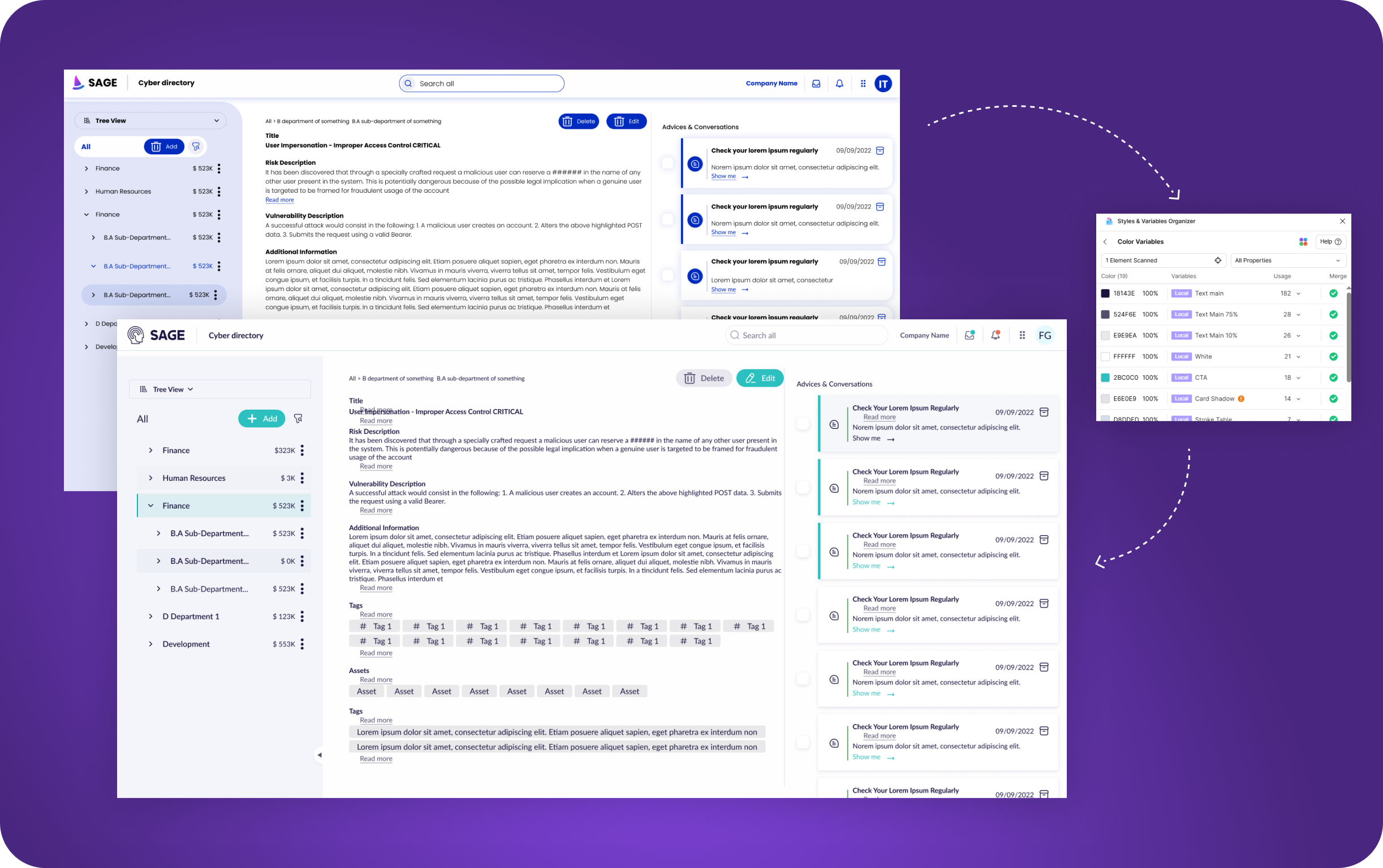
SAGE, a cyber company, came to us with an existing product that suffered from usability and visual issues, asking for something between an alignment and a quick facelift. Easy, fast implementation was a threshold requirement. We worked under a significant constraint: a style guide with no Variables, which prevented sweeping changes to colors, fonts and behaviors. We found a nimble solution in a Figma plugin, “Styles & Variables Organizer,” which scans all the screens and enables instant swapping of colors and fonts, detecting deviations from the style guide and unifying them in a single click. That’s how we achieved visual and functional alignment across the board. Within a few days, we handed development a new, precise style guide ready for implementation, with minimal friction from code to production.

The Impact, in Their Words

Tal Rosenfeld
Product Manager
״

Working with UI was a game changer for us – their team combined creativity with strategic thinking and precise results.

Clalit Health Services
PMO
״

Update: We went live this week with the new menu module, and the feedback is great!!! I’ll quote the users: “Wow…I have to say the system looks great, is super convenient and meets all my expectations”

Ituran
PM
״

The UX team demonstrates exceptional problem-solving skills, attention to detail, and a deep understanding of user needs. Their expertise and dedication are invaluable to us and we are confident that this will lead to the success of the project.

Lightbits
Product Manager
״

I would like to express my sincere appreciation for the professionalism and commitment demonstrated by each member of the team throughout this journey.

Elbit
Dev
״

I can’t believe we didn’t build it like this until today! This is exactly how it has to look.

Clalit Health Services
PMO
״

The new version of the system went live yesterday. User responses were overwhelmingly positive, as the system is now more accessible, more convenient, and streamlines work processes.

Discount Bank
VP Product
״

This week we completed an extraordinary Design Sprint workshop (a busy two days), hosted by UI Company. A workshop that brings to light a joint brainstorming of the business people, our excellent developers, and us, the product managers. Thank you to all those who took part in this exciting effort and opening shot.

Tell Us More

    contact form