Defense projects

Cityshop

More Projects:

The Company &
the Product

CityShob is a system for smart cities. It is intended for various municipal entities as well as for the police and other law enforcement agencies. It increases coordination between the above-mentioned entities, allows for reducing risks, handling incidents and threats, and increasing safety in the city. The system also increases operational efficiency, making life in the city better.

Project goal

The goal was to perform a facelift to the system that would both upgrade the appearance to a more modern one and solve UX issues that users were experiencing. The goal was to shorten the time to identify an incident, optimize real-time monitoring, shorten operation times, and reduce operational errors.

All this while using the existing development infrastructure and minimizing the cost of upgrading.

The Challenges

Simplifying Operational Complexity

CityShob is a highly complex operational system, used across three physical screens: data, video, and city map. Operators need to monitor all three continuously in real time.

Users struggled with the amount of information and the cognitive load required to understand what was happening, where to focus, and what action to take. The challenge was to simplify the experience, make the interface clearer and more intuitive, and help users quickly identify what matters most.

Designing Within Layout Constraints

Due to budget and technical constraints, we were required to preserve the system’s overall structure and avoid major layout changes, except for the addition of a menu.

This meant the redesign had to improve usability, clarity, and visual hierarchy mainly through design decisions – without rebuilding the product or changing its core architecture.

Clarifying Cross-Screen Relationships

The system’s information architecture included multiple hierarchy levels and many interactions between elements across different screens.

For example, selecting a row in a table could affect the information displayed on the video screen or city map. The challenge was to create design solutions that help users understand what influences what, where the current focus is, and how information across screens is connected.

Executive Solution Summary

Executive Solution Summary

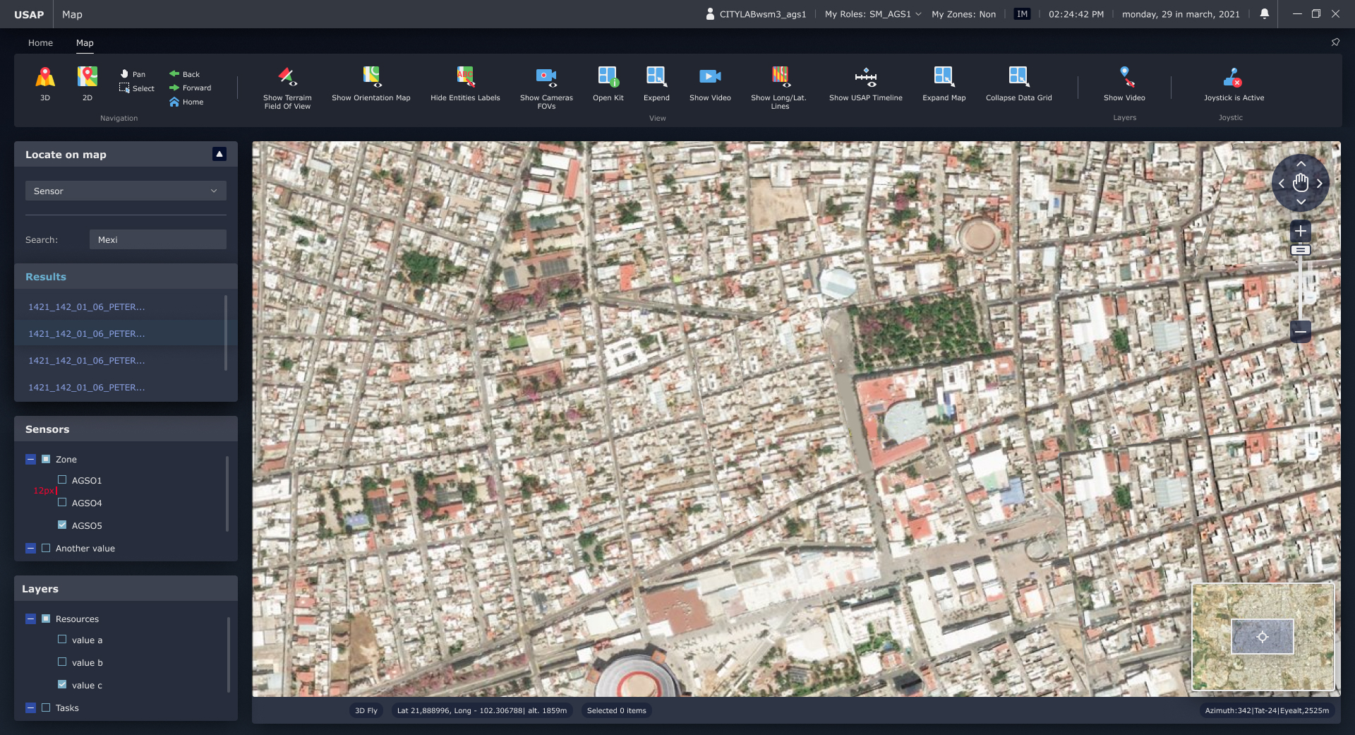
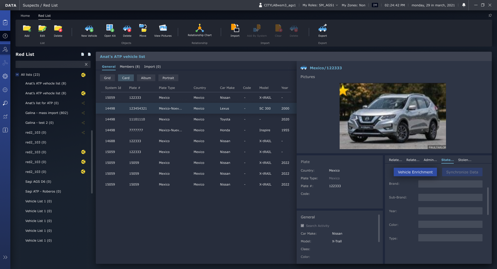
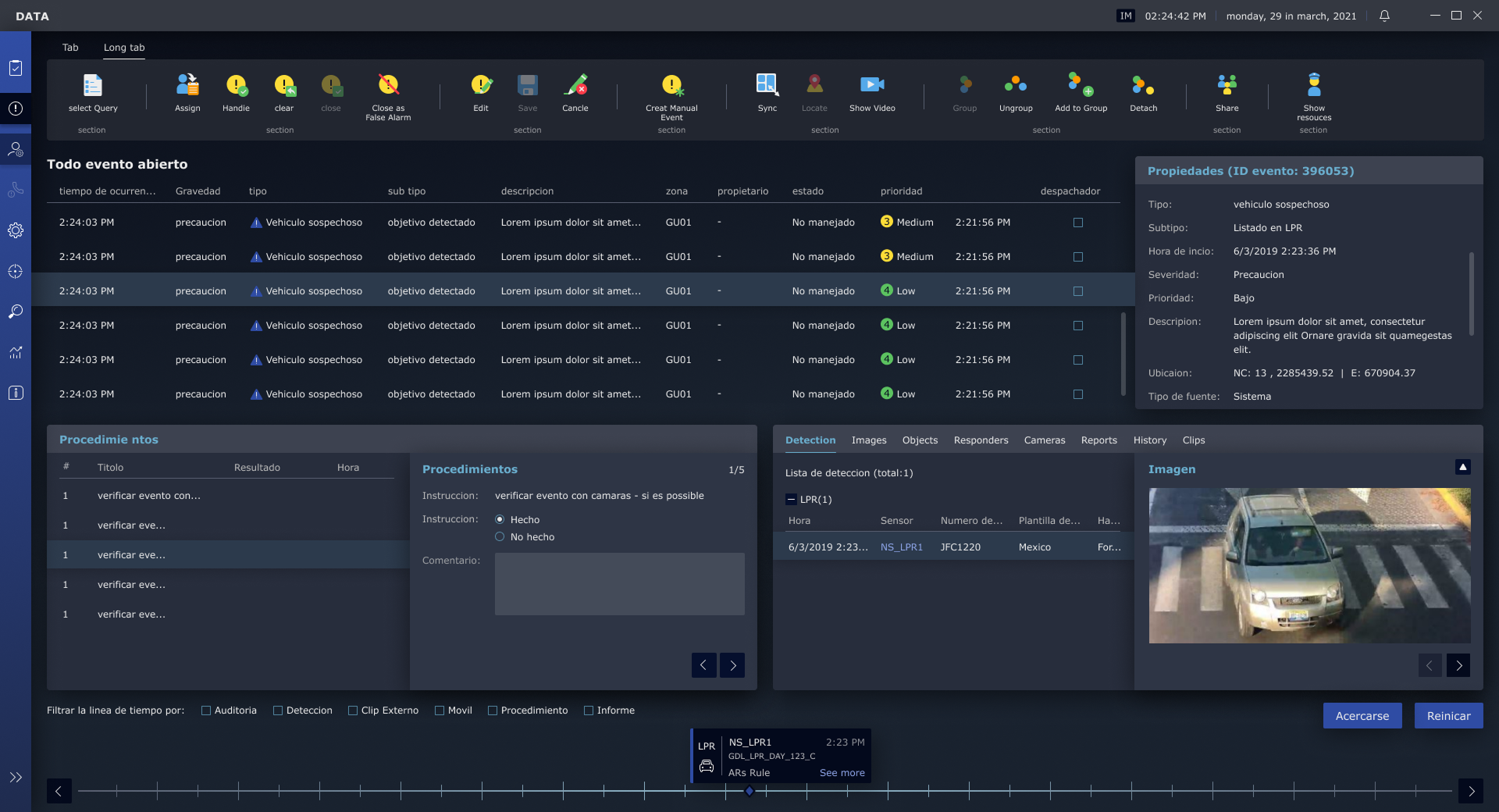
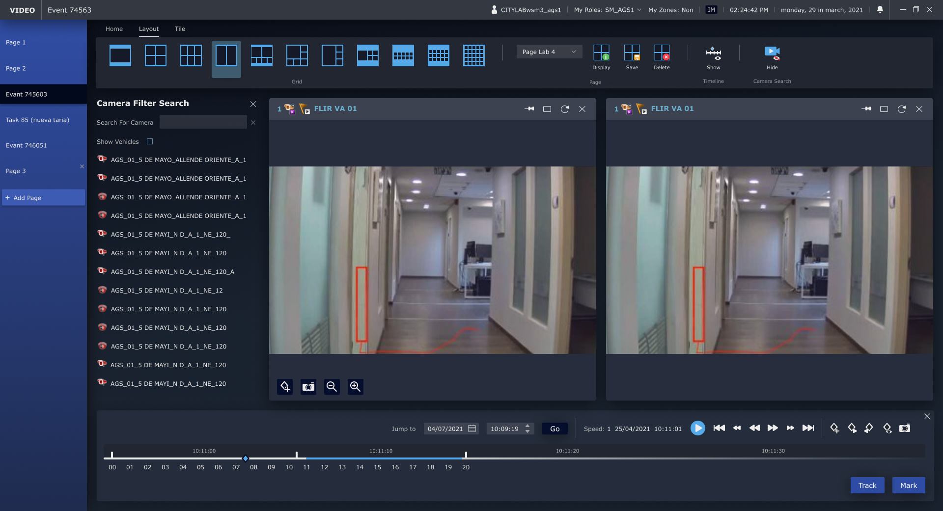
The solution was a focused UX/UI facelift that improved clarity, hierarchy, and usability while preserving the system’s existing structure.

We refined the visualization of complex information hierarchies, replaced the icon set with clearer and more modern icons, and added a navigation menu to replace an overloaded row of tabs.

This allowed us to modernize the system, improve orientation, and reduce cognitive load without requiring a full rebuild.

Our Process

Group 1707478609
Group 1707478732 (1)
Group 1707478674 (1)

Learning the System and Operational Context

We began by studying the existing system and visiting the control rooms to understand how users work in real conditions: dark environments, real-time event monitoring, and continuous use of multiple screens.

We also studied the company’s visual language so we could modernize the interface while keeping it aligned with the existing brand.

01
02

Main Screen Design & Hierarchy Rules

We started by designing the main screen, where we defined the core visual hierarchy rules for the entire system.

These rules helped clarify information levels, statuses, actions, and the relationships between different areas and screens. Each additional screen was then designed according to the same logic, with ongoing validation together with the product manager to ensure consistency.

Close support during development

We worked closely with the development team throughout implementation, helping resolve issues that emerged from the existing system limitations.

This close collaboration ensured that the new design could be integrated into the current infrastructure without requiring expensive or complex development changes.

03

Our Solution

Improving the UX and Visual Clarity

Improving the UX and Visual Clarity

The system received a modern, clearer visual design, with stronger information hierarchy that makes it easier for users to navigate, monitor, and manage events in real time.

We replaced the existing icons and visual elements with more intuitive, contemporary icons that help users quickly identify available actions, system statuses, and the possible impact of each action.

Creating a Consistent Design Logic

Creating a Consistent Design Logic

We created a design logic that helps users follow changes across the system, understand how actions in one area affect other screens, and operate the system more accurately.

All of this was done while fully preserving the existing system infrastructure, significantly reducing development time and cost.

The result was an improved user experience with better readability, clearer orientation, and stronger operational control – even in high-load, real-time situations.